View Page Previews Across Devices - Squarespace Guide
To see how your website content appears across different devices and browser windows, follow these effective preview methods:
Live Preview Panel
While editing, changes appear in real-time on the right side of the screen. For mobile device views, the preview automatically adjusts based on your browser window size.
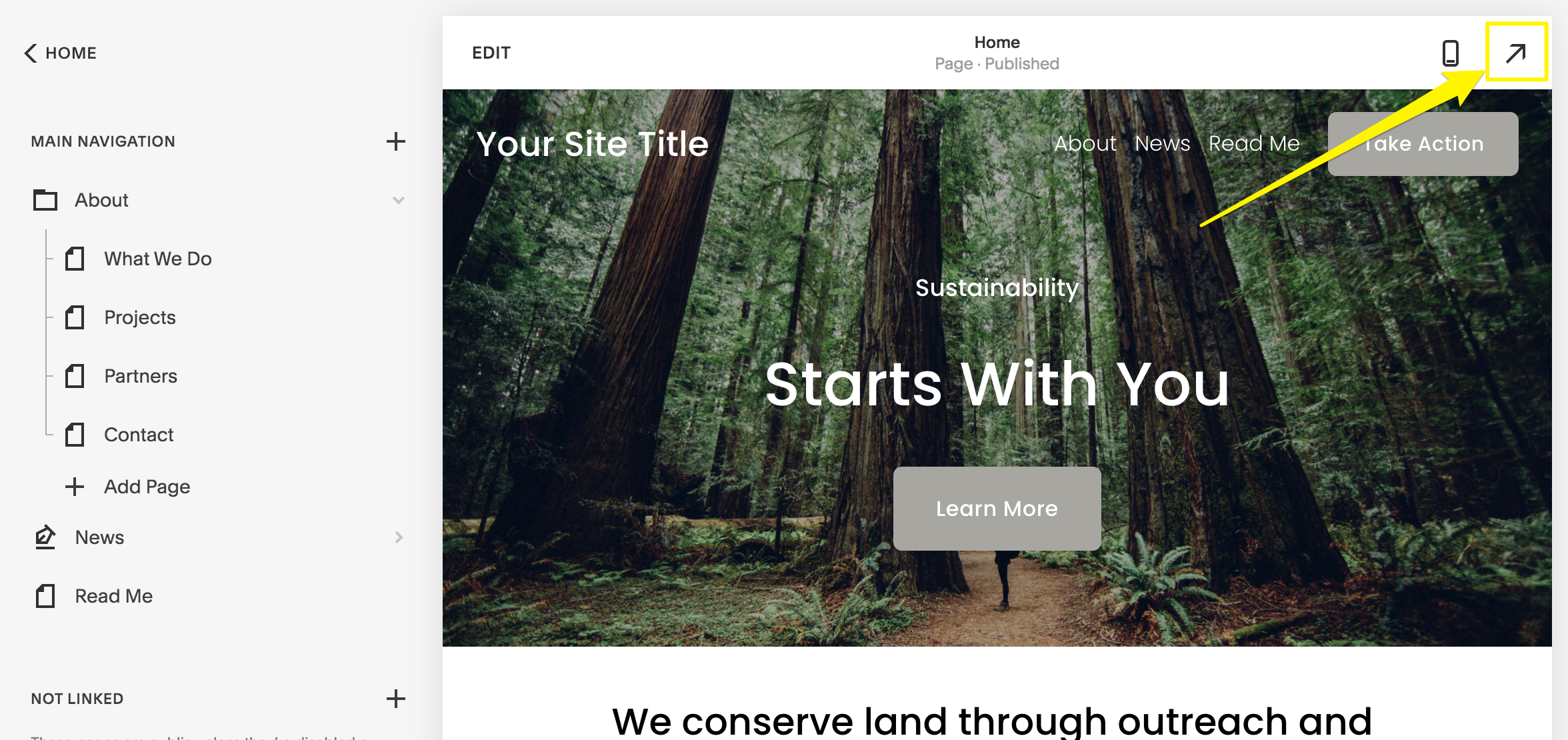
Yellow arrow to the right
Full-Screen Preview
On Desktop:
- Hover over the top right corner
- Click the arrow to expand and hide editing panels
- See full-screen preview without editing notes
- View page slugs in the browser address bar
- Click arrow again to return to editing
On Mobile App:
- Tap preview bar at bottom to expand/collapse
- On iPad, use full-screen icon to hide menu
- Toggle between mobile and desktop views using computer icon
Blog Post Previews
- Save post (as draft or published)
- Click post title in sidebar
- View preview on right
- Use expansion arrow for full preview
- Click arrow to return to sidebar
Additional Preview Methods
Device Preview:
- Use Preview by Device feature to check different screen sizes
Incognito Mode:
- View site as visitors see it
- Helpful for checking embedded code visibility
Browser Zoom:
- Use Ctrl/⌘ + or - to adjust view width
- Quick way to test responsive design
Preview Without Publishing
Hide content from visitors while editing:
- Disable pages temporarily
- Add password protection
- Move pages to Unlinked section
- Test new templates before going live
These preview options ensure your site looks perfect across all devices before making changes public.
Related Articles
How to Transfer Third-Party Domains Between Squarespace Sites