Comprehensive Guide to Site Preview Options in Squarespace
Preview your site's content on different devices and browsers effectively with these essential methods:
Live Preview While Editing
The right side of your screen shows real-time updates as you edit, eliminating the need to switch between modes constantly. For a clearer view, click the arrow in the top-right corner to expand the preview and hide editing panels.
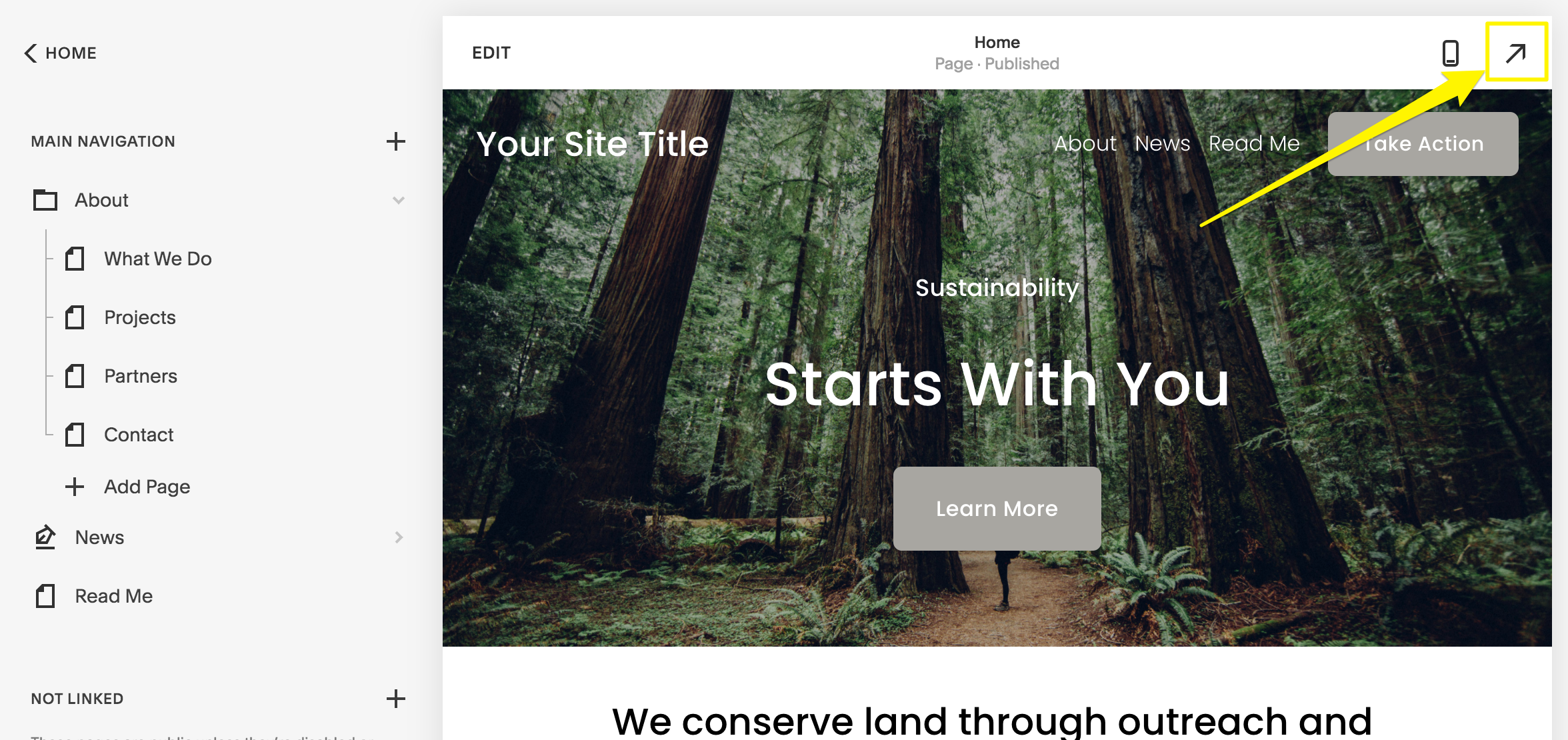
Yellow arrow to the right
Mobile Preview Options
- Phone: Use the preview bar at the bottom of the screen
- iPad: Tap the fullscreen icon to expand preview
- Switch between mobile and desktop views using the computer icon
Blog Post Preview
- Save your post (as draft or published)
- Click the post title in the sidebar
- View preview on the right
- Use expand arrow for full-screen view
Device-Specific Testing
Test your site across different devices using:
- Device View for multiple device previews
- Incognito mode to see exactly what visitors see
- Browser zoom (Ctrl/⌘ + or -) for wider screen views
Preview Before Publishing
Keep content hidden while working on it:
- Disable pages temporarily
- Add password protection
- Move pages to Unlinked section
- Test new templates before activation
These preview methods ensure your site looks perfect across all devices before going live. Use them regularly to maintain a consistent user experience for all visitors.
Related Articles
How to Transfer Third-Party Domains Between Squarespace Sites