Squarespace Image Cropping Guide: Tips & Solutions
Images play a crucial role in Squarespace websites, with automatic cropping occurring to fit various layouts and browser sizes. Here's how to manage and optimize image cropping effectively:
Understanding Image Containers
Images are placed in containers that control their display. Two main behaviors occur:
- Most common: Images conform to container dimensions, with cropping to fill the space
- Less common: Container adjusts to image dimensions for full display
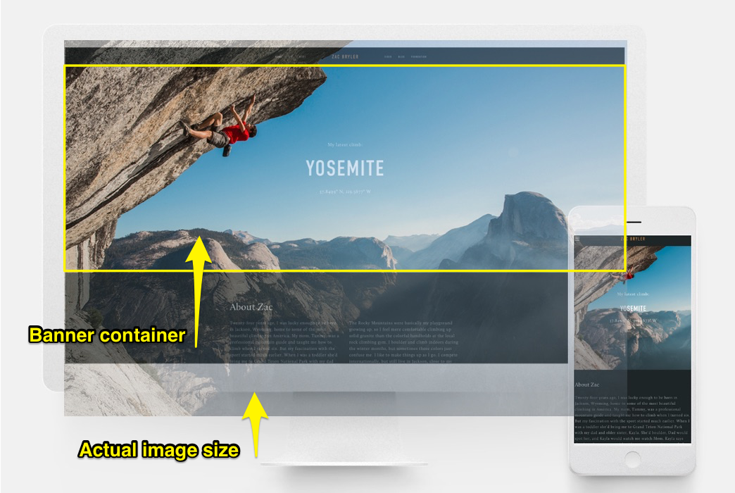
Climber on rocky wall
Image Block Management
In the Intuitive Editor:
- Fill setting: Images crop when resized
- Fit setting: Images maintain original ratio when resized
Classic Editor options:
- Use crop handle for adjustments
- Double-click crop handle to reset
- Add spacing blocks for resize without crop
- Use focal point for centering
Banner Images
For consistent banner appearance:
- Maintain similar image ratios
- Customize banner height and overlap
- Adjust focal points for better centering
- Check mobile view appearance
Background Images
Key considerations:
- Adjust section height/width to show more content
- Images can repeat, display at specific dimensions, or fill screen
- Keep images under 2500 pixels for mobile optimization
Black leather backpack with buckle
Gallery Management
Options vary by version:
- Version 7.1: Use gallery sections
- Version 7.0: Use Gallery Pages
- Control display through Gallery tab settings
- Adjust image ratios and thumbnails per row
- Use focal points for optimal centering
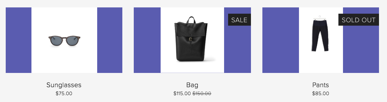
Store Product Images
Best practices:
- Use similar image proportions
- Pre-crop images before upload
- Adjust store section settings for consistency
- Set product image ratios in Site Styles
- Use focal points for optimal product presentation
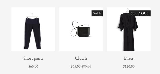
Black dress on hanger
Landing Pages
Remember:
- Always expect some cropping, especially on mobile
- Cropping depends on image height, browser width, and layout
- Test across different devices for optimal display
- Use focal points to control important image elements
Related Articles
How to Select and Customize Your Squarespace Template: A Complete Guide