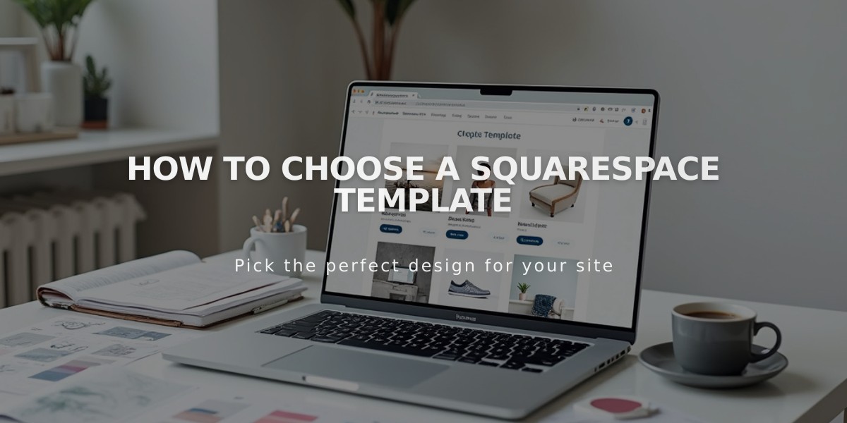
Navigation Customization Guide: How to Style & Optimize Your Site's Menu
Navigation links help direct visitors to different sections of your site. Here's how to style them effectively:
Finding Navigation Style Settings
Navigation styles are primarily controlled through your site's header editor, where you can adjust:
- Layout and positioning
- Colors and spacing
- Desktop vs. mobile appearance
- Fixed positioning
- Padding around text
Additional customization is available through Site Styles settings.
Font and Size Customization
To modify navigation fonts:
- Open Site Styles
- Navigate to Fonts section
- Select "Site Navigation"
- Choose font family, weight, and size
- Save changes
Color Customization
To change navigation colors:
- Open header editor
- Click Style
- Adjust Navigation Color setting
- Save changes
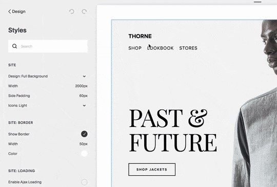
Man between "Past and Future"
Layout and Spacing
Navigation layout varies by template:
- Horizontal layouts: Top left/center/right
- Vertical layouts: Sidebar or overlay
- Adjustable spacing between links
- Custom padding and width options
Mobile Navigation
Mobile navigation automatically:
- Collapses into a hamburger menu (☰)
- Inherits desktop styles for consistency
- Adapts based on screen size
- Allows custom icon styling
- Can be hidden on select templates
Key Mobile Considerations:
- Header buttons appear behind menu
- Font sizes are fixed
- Icon visibility can be controlled
- Layout adjusts automatically for device width
Tips for Optimal Navigation:
- Keep link titles concise
- Group related pages in dropdowns
- Consider secondary navigation for additional links
- Test appearance across devices
- Maintain consistent branding
The navigation system automatically adjusts for optimal viewing across devices while maintaining your style preferences and brand consistency.