Your Guide to Customizing & Designing Website Navigation SEO Tips
Navigation links are a crucial component of your website design. They direct visitors through your site's content and typically appear at the top of your website, with some templates supporting footer or sidebar placement.
To customize your navigation, start by adding your desired pages in the Pages panel. Only linked pages will appear in your navigation. You can adjust the link text through page settings and reorder links by dragging and dropping them in the Pages menu.
Styling Navigation in Version 7.1
Navigation styling is primarily controlled through the header editor, where you can adjust:
- Layout and positioning
- Colors
- Link spacing
- Padding around text
- Fixed navigation settings
- Desktop vs. mobile display options
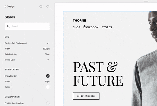
Screenshot of the Thorne shop page
Font and Size Customization
By default, navigation inherits your site-wide font settings. To set unique navigation fonts:
- Open Website Styles
- Navigate to Fonts > Assign Styles
- Select Website Navigation
- Choose custom font settings or sizes
Color Customization
For Version 7.1:
- Open the header editor
- Click Style
- Adjust Navigation Color
For Version 7.0:
- Open Website Styles > Colors
- Edit your header's color scheme
- Modify Navigation Links settings
Mobile Navigation
On mobile devices, navigation automatically collapses behind a menu icon (☰). You can customize:
- Menu icon style
- Layout on mobile devices
- Color schemes
- Breakpoint settings for mobile display
The mobile menu appearance varies by template, with most showing either a hamburger icon (☰) or "Menu" text. Some templates allow you to hide the mobile menu icon entirely through Website Styles.
Template-Specific Layouts
Navigation displays differently across templates:
- Horizontal layouts (most common): Adirondack, Avenue, Bedford
- Vertical layouts: Supply, Wells, Aviator
- Centered layouts: Pacific, Native, Galapagos
- Customizable positions: Brine, York, Montauk
Remember that proper navigation design balances aesthetics with usability, especially considering both desktop and mobile experiences.
Related Articles
How to Select and Customize Your Squarespace Template: A Complete Guide