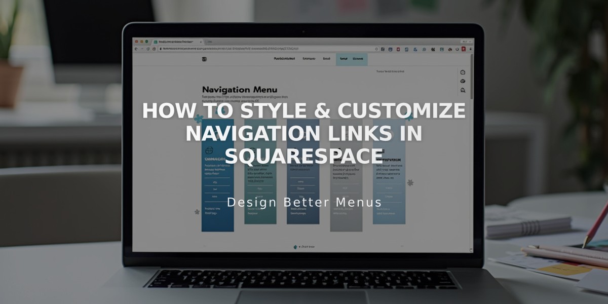
How to Style & Customize Navigation Links in Squarespace
Navigation links are key elements that direct visitors to different sections of your site. Here's how to style them effectively:
Basics of Navigation Styling
- Navigation typically displays at the top of your site
- Some templates support navigation in footers or sidebars
- You can customize fonts, colors, sizes, and layout
- Links are managed through the Pages panel
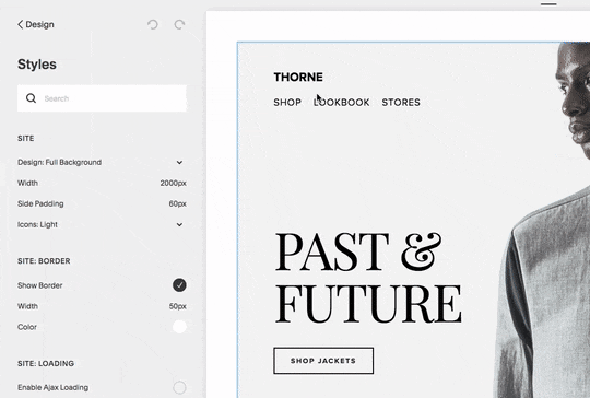
Finding Navigation Style Options
For Version 7.1:
- Access header editor to modify:
- Layout and spacing
- Colors
- Link spacing
- Padding
- Fixed positioning
- Mobile display settings
For Version 7.0:
- Open Design panel
- Click Site styles
- Look for "Navigation" related tweaks
- Use preview highlighting to find relevant settings
headshot of man wearing suit
Font and Size Customization
- Change site-wide font or set navigation-specific font
- Adjust font weight, style, and size
- Modify line height and letter spacing
- Use rem values for custom sizing
Color Adjustments
- Edit through header editor (7.1) or Site styles (7.0)
- Customize navigation link colors
- Modify social icon colors
- Set different mobile header overlay colors
Layout and Spacing Options
- Position links horizontally or vertically
- Adjust padding and spacing between links
- Set alignment (left/center/right)
- Customize based on device type
Mobile Navigation Features
- Collapses into menu icon (☰) or "Menu" text
- Customizable icon style and position
- Inherits desktop styling for consistency
- Responsive breakpoints vary by template
Best Practices
- Keep navigation titles concise
- Group related pages in dropdowns
- Consider mobile display when planning layout
- Test across different device sizes
- Maintain consistent branding
Special States
- Hover effects for interactive feedback
- Active state for current page indication
- Custom spacing for different states
- Template-specific style options
By following these guidelines, you can create an intuitive and visually appealing navigation system that enhances user experience across all devices.