How to Use Gallery Blocks: A Guide to Adding Image Galleries in Squarespace
Gallery blocks are powerful tools for showcasing images and videos in various layouts on your website. Here's how to use them effectively:
Supported Content Areas
- Blog posts
- Single events
- Additional product information
- Any content area that supports blocks
Note: Gallery blocks cannot be added to page sections, landing pages, portfolio subpages, or footers.
How to Add a Gallery Block
- Click an insert mark in a supported area
- Select "Gallery"
- Use Content tab to add media
- Use Design tab to customize layout
Adding Media Content
Images:
- Drag and drop multiple images
- Click uploader to select files
- Search existing images via "+" icon
- Add stock images through Search Images
Videos:
- Supports YouTube and Vimeo URLs
- Use embed codes for other services
- Can add custom thumbnails
- Enable "Use thumbnail" setting
Available Layouts
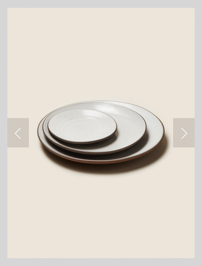
Slideshow:
- Displays one item at a time
- Supports autoplay
- Navigation arrows optional
- Customizable height

Three plates on light brown surface
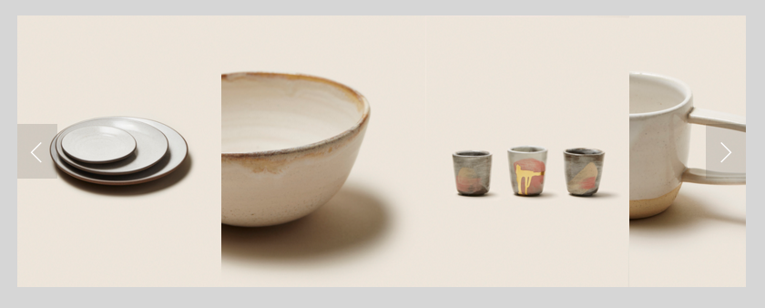
Carousel:
- Horizontal scrolling display
- Multiple items visible
- Automatic scrolling option

Ceramic dishes on a wooden table
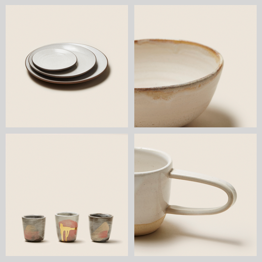
Grid:
- Even grid layout
- Customizable spacing
- Lightbox option

Ceramic assortment of dishes and cups
Stack:
- Single column display
- Full-width items
- Minimal spacing

Clean Squarespace design with three rows of images
Customization Options
- Image cropping and resizing
- Title and description display
- Click URLs for images
- Lightbox settings
- Navigation controls
- Auto-play settings
- Spacing adjustments
Mobile Optimization
- Layouts adapt for mobile viewing
- Two-column grid on mobile
- Touch-friendly navigation
- Responsive design adjustments
Tips for Best Performance
- Limit galleries to 250 items
- Optimize images for web
- Use consistent aspect ratios
- Consider page load times
- Organize smaller galleries across multiple pages
Related Articles

Advanced Guide: How to Preview & Test Website Changes in Squarespace

