How to Format Images for Online Display: A Complete Guide
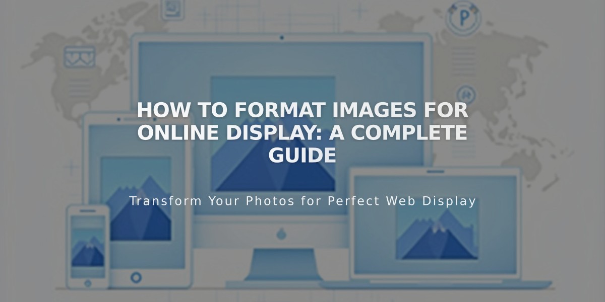
Website images should be optimized for crisp display across all devices. Here's what you need to know:
Key Requirements:
- Maximum file size: 20 MB (recommended: under 500 KB for fast loading)
- Minimum width: 1,500 pixels (2,500 pixels ideal)
- File types: JPG, PNG, GIF
- Color mode: RGB
Image Size Optimization:
- Squarespace creates 7 responsive versions (100px to 2,500px wide)
- Upload images larger than your maximum display size
- Keep total page size under 5 MB for optimal loading
- Images under 1,500px wide may appear blurry
Best Practices:
- Use PNG format for images with text or transparent backgrounds
- Maintain consistent aspect ratios in galleries (all landscape or all portrait)
- Add alt text for accessibility and SEO
- Overlay text instead of embedding it in images
- Consider mobile cropping when using banner images
Troubleshooting Common Issues:
- Blurry images: Check minimum width requirements
- Color distortion: Verify RGB color mode
- Cropping problems: Use focal points and proper aspect ratios
- Resolution changes: Follow size recommendations for consistent display
Special Considerations:
- Logos: Different requirements for website vs. email use
- Banners: Will crop differently on mobile devices
- Galleries: Match aspect ratios for best appearance
- Transparent backgrounds: Use PNG format
For Acuity Scheduling:
- 600px x 600px maximum for calendar images
- 600px x 120px maximum for logos
- Square images (1:1 ratio) recommended
- Lower file size limits than regular site images
Remember to keep original files on your computer, as downloaded versions may have reduced quality.
Related Articles

How to Set Up a Podcast Blog with Squarespace: Complete Guide

