Font and Color Selection Guide: Create Your Website's Perfect Visual Identity
Fonts and colors play a crucial role in setting your site's tone and making a lasting first impression. Here's how to choose them effectively:
Choosing the Right Fonts
Different fonts convey different emotions and brand personalities. Consider these key aspects:
- Serif fonts: Traditional, formal, with small decorative lines
- Sans serif fonts: Modern, clean, better for web readability
- Consider your content purpose and target audience
- Think about your brand's mood (fun vs. serious, modern vs. classic)

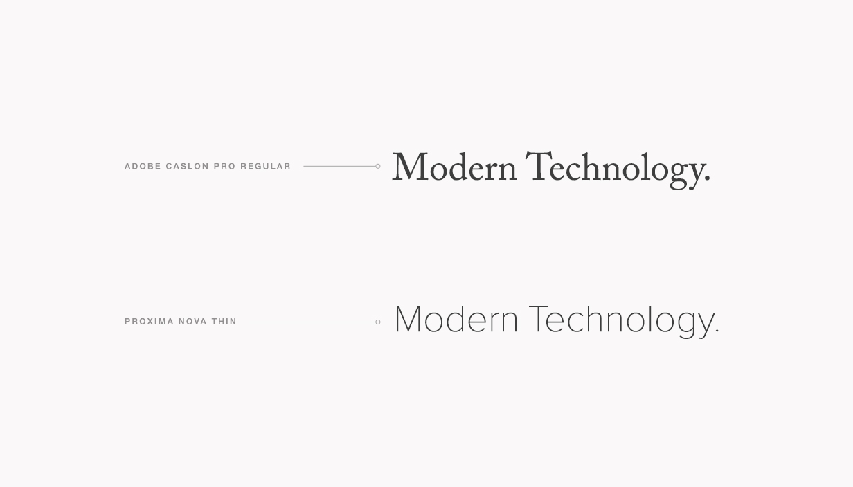
Two modern fonts compared
Font Pairing Tips:
- Combine serif with sans serif for contrast
- Limit yourself to two font families
- Use different sizes for visual hierarchy
- Ensure readability across all devices
- Match fonts to your brand personality

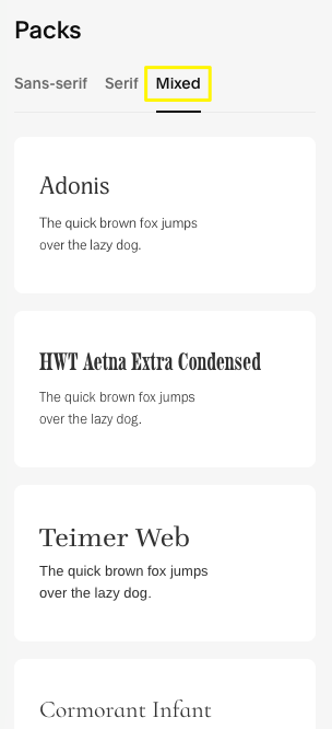
List of font packages
Selecting Effective Colors
Create a cohesive color scheme by:
- Drawing inspiration from your brand or logo
- Matching colors to your content theme
- Using your existing imagery as reference
- Maintaining proper contrast for readability
- Limiting your palette to 2-3 main colors

Create new event page
Best Practices:
- Ensure high contrast between text and background
- Use consistent colors throughout your site
- Apply accent colors sparingly for emphasis
- Consider color accessibility for all users
- Test your choices across different devices
Remember to maintain consistency in both fonts and colors across your entire site. Your choices should reflect your brand identity while ensuring optimal readability and user experience.
The key to success is finding the right balance between aesthetics and functionality. Test different combinations before finalizing your design, and don't be afraid to make adjustments based on user feedback.
