
Mobile-Friendly: Key Style Changes for Homepage 7.0 Design
Mobile Homepage Styling Guide for Version 7.0
Your homepage automatically adapts to mobile devices through responsive design, stacking content in a single column for optimal viewing. Here's what you need to know about mobile display:
Device Preview Options:
- Use device view to check appearance on mobile, tablet, and desktop
- Test on actual devices by entering the URL directly
- No separate mobile URL needed
Background Image Tips:
- Choose images without text or borders
- Select images that work well when cropped
- Ensure flexibility in image composition
Text Considerations:
- Keep body text concise
- Use smaller font sizes to prevent text cutoff
- Add appropriate spacing between words
Layout Adjustments for Mobile:
Split Layouts:
- Images stack above text
- Affects Flash and Spotlight layouts
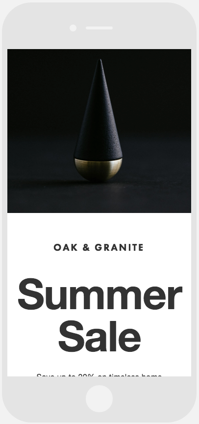
Black and gold metal cone
Text Arrangements:
- Left-side text stacks above right-side text
- Applies to Debut and Projector layouts
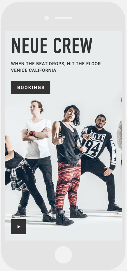
Four dancers in artistic poses
Harbor Design:
- Map section stacks above text content
- Maintains horizontal division
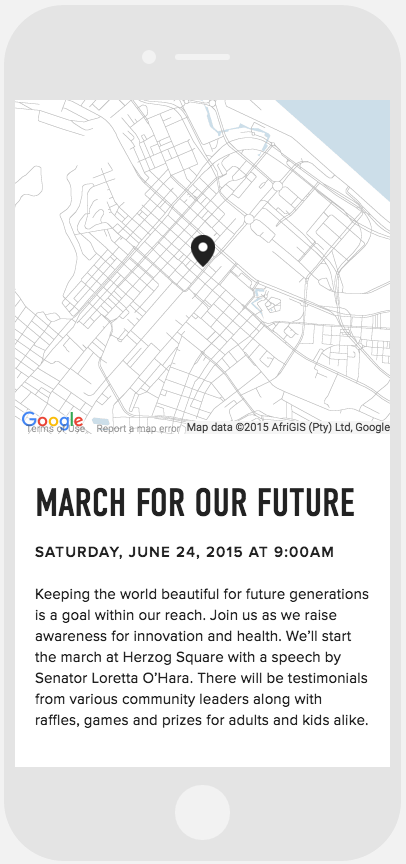
Map with location marker