Customize Your Website's Look: A Guide to Choosing Fonts and Colors
Fonts and colors are crucial design elements that define your website's personality and user experience. Here's how to select them effectively:
Font Selection Guidelines
Sans-serif fonts are ideal for web content due to their clarity on digital screens. Serif fonts work well for specific niches like historical or traditional content. Consider these factors when choosing fonts:
- Your website's primary purpose
- Target audience demographics
- Brand personality (modern vs. classic, professional vs. casual)
- Readability across devices

Black text on white background
Font Pairing Best Practices
- Limit your selection to two complementary fonts
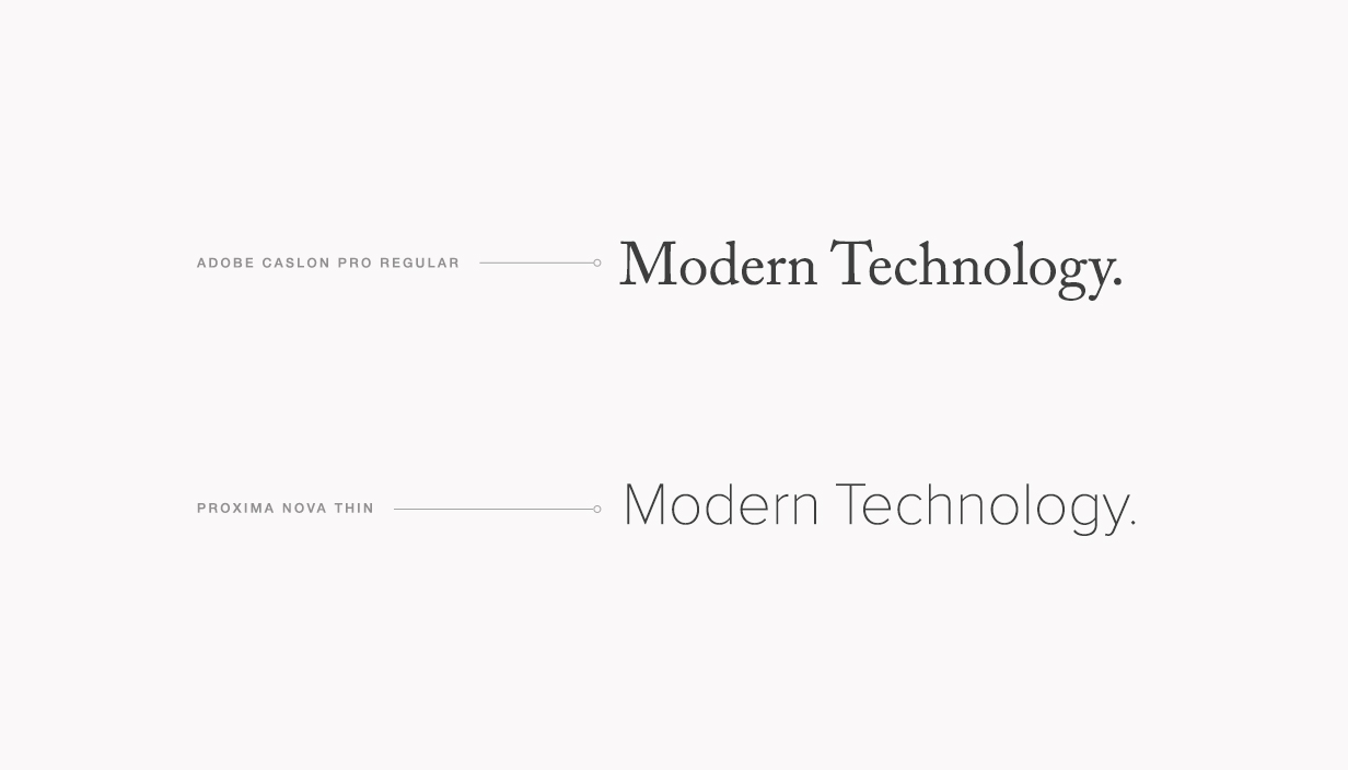
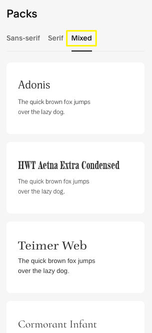
- Combine a serif with a sans-serif for optimal contrast
- Use different sizes to create visual hierarchy
- Maintain consistency across your website

Simple sans-serif fonts
Effective Color Selection
Choose colors that:
- Reflect your brand identity
- Match your content theme
- Complement your existing imagery
- Maintain good contrast for readability
Color selection tips:
- Draw inspiration from your logo or brand materials
- Consider your industry (e.g., earth tones for nature-related content)
- Use your website's images to create matching color palettes
- Limit your palette to maintain visual harmony

White-violet abstract gradient
Important Considerations
- Ensure text remains readable with proper contrast
- Test designs across different devices
- Keep accessibility in mind when selecting colors
- Update your design as your brand evolves
Remember: Your website's design should create a cohesive experience that reflects your brand while maintaining functionality and accessibility for all users.


