Shop Page Customization Guide: Design Products and Layout Settings
Shop pages showcase your products in a searchable landing page format, while product detail pages display individual items. Both areas offer customizable style options.
Version 7.1 Style Options:
- Access via Edit > paintbrush icon in shop sections
- Customize product detail pages through Edit Design
- Changes apply across all shop pages for consistency
Shop Page Customization:
- Image width and spacing
- Column layout (minimum 2)
- Text alignment and spacing
- Add to Cart button visibility
- Category navigation placement
- Price display options
Product Detail Page Features:
- Four layouts: Simple, Break, Half, and Full
- Customizable image galleries
- Variant display options
- Description positioning
- Add to Cart button placement

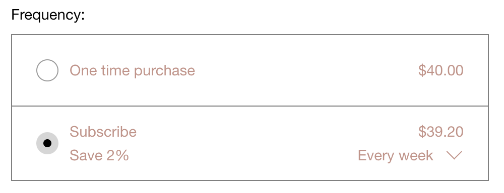
Purchase and subscription option circles
Important Design Elements:
- Similar Products section follows shop page styles
- Add to Cart and Checkout buttons match website color scheme
- Variant display as buttons or drop-down menus
- Quantity field shows when inventory > 1 or variants exist
- Category navigation displays after adding categories
- Mobile-responsive design adjustments
Advanced Features:
- Image zoom and Quick View options
- Mouseover effects for product images
- Customizable status badges (Sold Out, On Sale)
- Lightbox functionality
- Font and color scheme consistency
Mobile Considerations:
- Vertical stacking of products
- Simplified navigation
- Swipeable product galleries
- Responsive column layouts
- Optimized button placement
All style changes maintain consistency across your website while allowing for brand-specific customization. Remember that some features vary between Version 7.0 and 7.1, and specific templates may have unique styling options.
Related Articles

How to Connect a Squarespace Domain to Your Website

