Mobile Styling Options Unveiled for Squarespace 7.0 Templates
Mobile devices account for over 50% of web traffic, making mobile optimization crucial. Version 7.0 of Squarespace offers specialized mobile styling options across different templates to enhance the mobile experience.
While all Squarespace sites feature responsive design by default, certain templates provide additional mobile customization through the Styles panel. Here's what you need to know:
Accessing Mobile Settings:
- Use View by device to preview mobile design changes
- Press Ctrl + F (Command + F on Mac) to search for "Mobile" in settings
- For font options, search for "Min"
Template-Specific Mobile Features:
Aviator:
- Toggle background image visibility
- Adjust logo size (except on Information Pages)
Brine:
- Configure up to two mobile navigation bars
- Fixed top bar option
- Custom header icon styles and placement
- Adjustable mobile breakpoint
- Shop page styling options
Farro:
- Dual mobile navigation bars
- Fixed top bar option
- Customizable header icons
- Shop page styling
- Index page grid title visibility
- Site title customization
- Separate mobile logo options
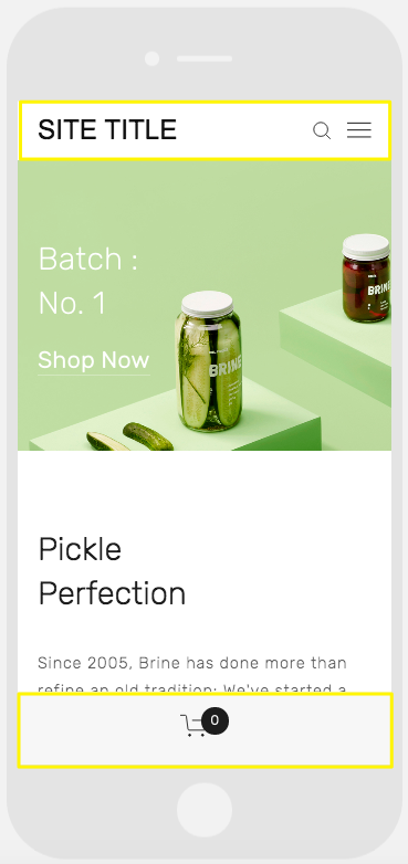
A smartphone displaying a website
Skye:
- Font scaling
- Shop page styling
- Logo/site title toggle
Tremont:
- Font scaling
- Device-specific size settings
- Shop page styling
- Mobile navigation customization
York:
- Font scaling
- Top mobile navigation bar
- Custom header icon styles
- Shop page styling
Key Mobile Style Features:
Font Scaling:
- Set maximum and minimum sizes for titles, headings, and text
- Ensures readability across devices
Logo Optimization:
- Adjust logo size for mobile displays
- Option to switch to text-based site title
Navigation Bars:
- Customizable top and bottom bars
- Flexible placement of elements like site title, cart, and search
- Color and style customization options
Shop Page Features:
- Mobile-specific product display options
- Customizable titles and pricing presentation
- Enhanced mobile shopping experience
These mobile optimization features help create a seamless user experience across all devices while maintaining your site's visual identity and functionality.
Related Articles
3 Easy Ways to Preview Your Squarespace Website Content