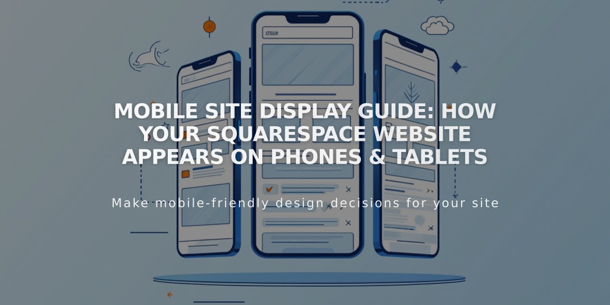
Mobile Site Display Guide: How Your Squarespace Website Appears on Phones & Tablets
Responsive design automatically adjusts your site's content for mobile devices. Content stacks vertically, making it easy for visitors to scroll and view without pinching or zooming.
Key Mobile Display Features:
- Navigation menus collapse into a hamburger menu icon
- Images and galleries adapt to smaller screens
- Product pages stack vertically with swipeable product images
- Pop-ups default to half-page style following Google guidelines
- Font sizes scale down proportionally
- Shopping carts appear consistently at top or bottom
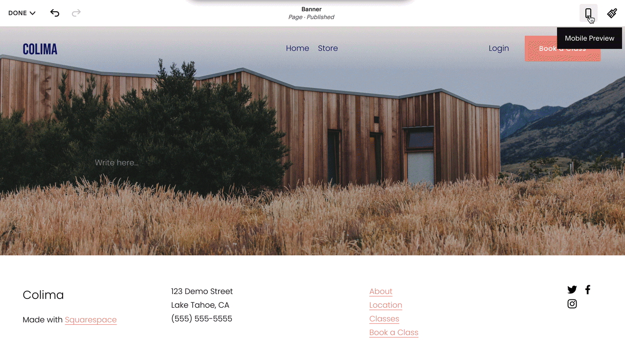
Wooden home on grassy field
Tips for Mobile Optimization:
- Test your site using device view and real mobile devices
- Set appropriate image focal points to control cropping
- Add mobile-specific logos if needed
- Enable mobile styles for best SEO performance
- Limit content per page for faster loading
- Use blog excerpts to prevent long scrolling
- Optimize image sizes
- Set mobile fallback images for video banners
Key Mobile Elements:
- Blocks stack vertically
- Galleries display in 1-2 columns
- Lightboxes support tapping but not pinch-zoom
- Hover effects convert to tap actions
- Built-in padding optimizes mobile display
- Audio/video play according to device capabilities
Mobile SEO Benefits:
- Google prioritizes mobile-optimized sites
- Responsive design improves search rankings
- Mobile styles meet Google's requirements
- No separate mobile URLs needed
- Fast loading speeds on mobile devices
Commerce Features:
- Products display in 1-2 columns
- Swipeable product galleries
- Streamlined checkout process
- Mobile-optimized shopping cart
- Category navigation adapts to screen size
Testing on mobile devices ensures optimal display across smartphones and tablets. The built-in responsive design handles most formatting automatically while allowing customization of key elements like headers and navigation.
Related Articles
Comprehensive List of Removed Squarespace Fonts: What You Need to Know