
How to Display Your Squarespace Site on Mobile Devices
Mobile Display Guide for Squarespace Sites
Squarespace uses responsive design to automatically adjust your site's content for all devices - computers, tablets, and smartphones. Content typically stacks vertically on mobile for easy scrolling without pinching or zooming.
Core Mobile Features:
- Automatic mobile optimization
- Google-friendly mobile SEO
- Device-specific preview tool for testing
- Built-in mobile styles (version 7.0)
- Automatic mobile adaptation (version 7.1)
Key Mobile Display Elements:
- Header Elements
- Announcement bar appears at top
- Navigation collapses into menu icon
- Site title/logo positioning maintained
- Images and Galleries
- Banner images crop to fit mobile screens
- Galleries display in 1-2 column grids
- Lightbox supported with tap functionality
- Content Blocks
- Stack vertically on mobile
- Multiple columns convert to single column
- Spacing blocks auto-hide on mobile
- Store and Commerce
- Products stack vertically
- Shopping cart appears at top/bottom
- Category navigation becomes swipeable/dropdown
- Text and Typography
- Fonts maintain style but may resize
- Clickable phone numbers in Safari
- Adjustable line height for readability
Testing Your Mobile Site:
- Use device-specific preview while editing
- Test on actual mobile devices
- Check different mobile browsers
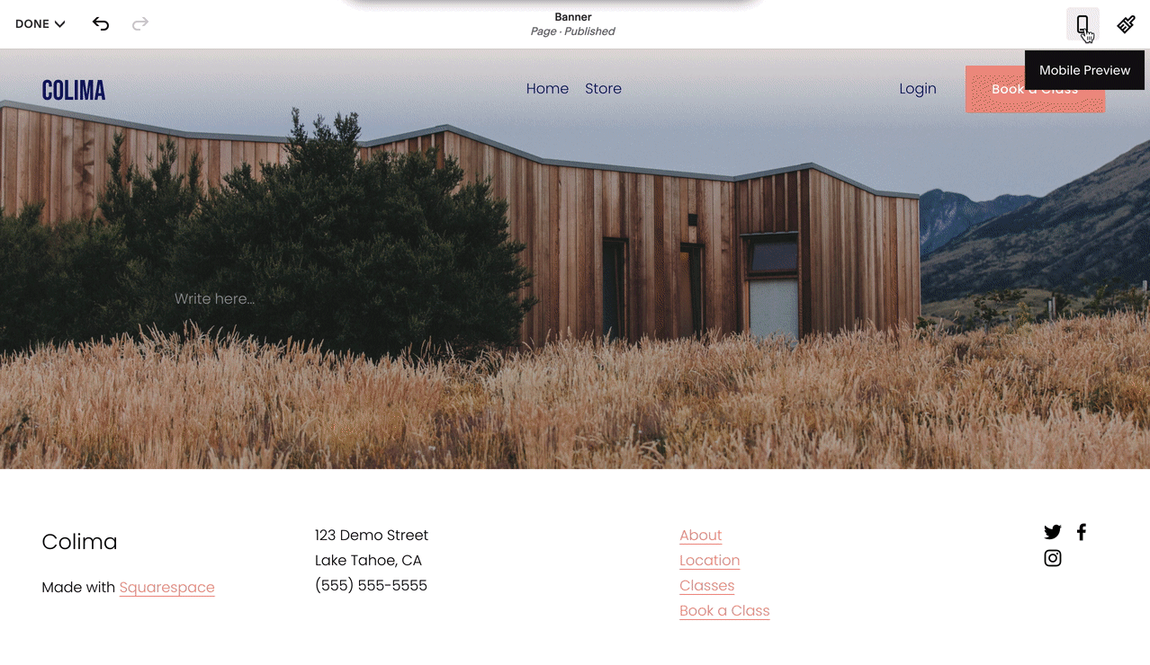
Screenshot of a wooden structure on a grass field
Mobile-Friendly Tips:
- Optimize image sizes
- Use blog excerpts
- Limit content on portfolio/index pages
- Enable mobile promotion pop-ups
- Maintain mobile styles for SEO benefits
Advanced Customization:
- Custom CSS available (limited support)
- Template-specific mobile options
- Mobile layout editing in Creative Editor
- Separate mobile logos possible
Note: While mobile styles can be disabled in version 7.0, it's recommended to keep them enabled for optimal performance and SEO benefits.
Related Articles
Comprehensive List of Removed Squarespace Fonts: What You Need to Know