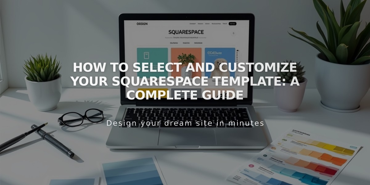
Complete Guide to Squarespace 7.0 Templates and Design Models
Squarespace version 7.0 templates create consistent site layouts while offering responsive designs that adapt to different screen sizes. Each template family includes unique style parameters and features that you can customize through Site Styles.
Template Basics
- Select a template when starting your Squarespace site
- Modify template selection at any time
- Each family has distinct features and style options
- All templates are mobile-responsive
Customization Options
- Adjust fonts, colors, and spacing through Site Styles panel
- Customize navigation menus and buttons
- Modify collection page styles (Events, Store Pages)
- Change banner images and backgrounds
- Style options vary by template family
Template-Specific Features
- Index Page availability and styles
- Page headers, footers, and sidebars
- Special effects like parallax scrolling
- Album, blog, events, gallery, and store features
Mobile Design
- All templates optimize for mobile devices
- Simplified navigation across platforms
- Mobile-specific style options available
- Preview with Device View while editing
Available Template Families:
- Adirondack
- Avenue
- Aviator
- Bedford
- Brine
- Farro
- Five
- Flatiron
- Forte
- Galapagos
- Ishimoto
- Marquee
- Momentum
- Montauk
- Native
- Pacific
- Skye
- Supply
- Tremont
- Wells
- Wexley
- York
Advanced Customization
- Add custom code for advanced modifications
- Use Code Block for custom functions
- Implement integrations via Code Injection
- Modify styles with CSS Editor
- Access Developer Platform for complete code control
Note: Template features cannot be mixed between families. For newer features, consider upgrading to Squarespace 7.1, which uses a different approach to style customization and page sections.
Related Articles
Migrate Marquee Template: Essential Guide for Upgrading to Brine