Advanced Mobile Styling Guide for Squarespace 7.0 Templates
For optimal mobile experience, specific Squarespace 7.0 templates offer enhanced mobile customization options through site styles. Here's what you need to know about these mobile-specific adjustments.
Finding Mobile Style Options
- Use device preview before accessing site styles
- Search for "Mobile" using Ctrl + F (Command + F on Mac)
- For font resizing, search for "Min"
Template-Specific Mobile Features
Aviator:
- Toggle background image visibility
- Adjust logo size (except information pages)
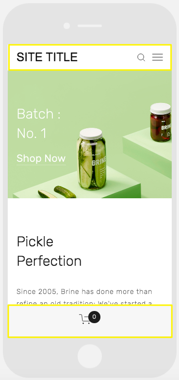
Brine:
- Configure up to two mobile navigation bars
- Optional fixed top bar
- Custom header icon styles and placement
- Adjustable mobile breakpoint width
- Store page styling options
Farro:
- Dual mobile navigation bars
- Fixed top bar option
- Custom header icon styles
- Store page customization
- Index Page thumbnail grid title visibility
- Site title styling
- Optional mobile-specific logo with adjustable height
Pickle jar on green background
Skye:
- Font size customization
- Store page styling
- Logo-to-site-title replacement option
Tremont:
- Responsive font sizing
- Device-specific logo height settings
- Store page customization
- Site title styling
- Mobile navigation background color
York:
- Font size adjustment
- Mobile top navigation
- Custom header icon styles
- Store page styling options
Key Mobile Style Features
Font Sizing:
- Set maximum and minimum sizes for titles, headings, and text
- Ensures readability across devices
Logo Sizing:
- Reduce mobile logo size to prevent overcrowding
- Maintain brand visibility while optimizing space
Mobile Navigation Bars:
- Customizable top or bottom placement
- Include site title, logo, cart, and search
- Adjustable colors and element positioning
- Support for unique mobile-specific styles
Store Page Customization:
- Mobile-specific styling for product titles
- Custom price and sale price formatting
- Enhanced mobile shopping experience
Remember that all Squarespace sites feature responsive design by default, automatically adjusting to any device or browser format.
Related Articles
Upgrading from Marquee to Brine Template: Step-by-Step Migration Guide